Sunday 15 January 2017

Album cover editing and costruction

-JPG or GIF
-Perfect square
-At least 1600 x 1600 pixels in size
-Best quality RGB Color Mode (this includes black and white images)
-If you’re distributing your music to the Amazon On Demand store (for printing physical CDs), you need a resolution of 300 DPI.

DON't 
-email addresses, URLS/websites, contact info (this includes Twitter handles), pricing,
-stickers from your artwork from a scanned copy of physical CD
-something that suggests format of the release “CD, DVD, Digital Exclusive, disc”
-cut off text or images
-an image that’s compressed into one corner with white space
-names of digital stores or their logos
-words that express temporality, like “new”, “latest single”, “limited edition” or “exclusive

http://www.tunecore.com/blog/2012/12/3-things-you-need-to-know-about-cover-art.html

The website above has helped me to ensure features and rules are included within my media products.


The Front cover of the album did not require a lot of editing. At very first I have increased the contrast by choosing adjustment - levels and I have increased it by 25 percent which made the background totally black. After that I have set the canvas size to create a perfect square by clicking on the image options and overwriting the pixel numbers. After that I have sharpened the image by clicking on filter-sharpen -unsharpen mask, and I have increased it with 10-15 percent. At very last I have added the name of the album, parental advisory logo and the name of the artist.


In Able to edit my CD cover I had to research tutorials on YouTube. I have managed to find one: https://www.youtube.com/watch?v=x1jXFUaEMKs which allowed mo to set up certain measurements for my media product


After I have set the pixel measurements I have added a photograph that I have edited earlier on of smoke, and added it onto my cd cover, then created a yellow layer that I have applied to the smoke by pressing ALT down on the keypad and then left clicking on to my smoke layer.  Which gave it the gold effect. At very last I only needed to add the writings.


The back cover did not require me to edit any photographs, I simply typed up the name of the songs with the artist, that were featuring and added the record label logos and a barcode


The insert however required me to edit the photograph I have taken of the gold chain. I have done this by increasing the contrast , then horizontally reflected it and decreased the opacity to get a nice and sophisticated reflection


Editing and Construction the music video


Here I am going to explain how I have constructed me music vide clip, and how I have added the effects that are present in the video. It will contain screenshots from the production for an easier way of explanation .


On the first image above we can see that the first thing I have done with the construction of my music video was adding the music. This only required me to grab the file and drag it to the empty space within Vegas pro


After that I have added my first video footage. A question came up saying "do you want to se your project video settings to match media. The reason why this came up, was because my footage had a 1920 x 1080p resolution, therefore when I have clicked on yes, that became the basic resolution. Of course I have used lower resolution footages such as the footages that I have recorded in 60fps instead of 30, that were 1280 x 720p which has not got a large difference between the footage before therefore we cannot see a large difference between quality.

I have inserted my first video. This was the introduction part which I have started with a fade in and fade out by dragging the top of the footage to the sides. This had a great intro like effect on my music video. Further more I have added another layer of the writings, that I have previously edited in Photoshop and saved as a PNG format picture without a background.
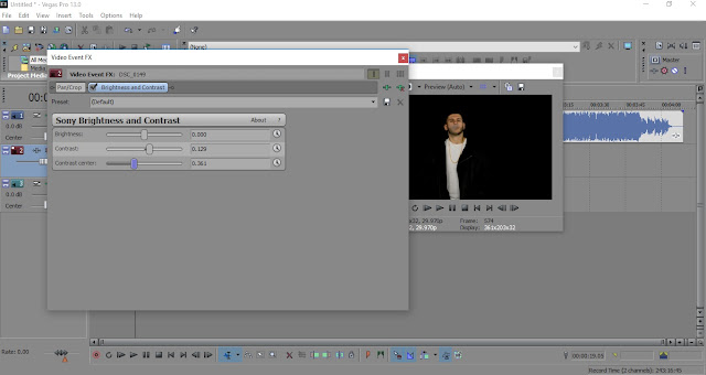
The following screenshot  shows the way I have set the frame within the music video. I have done this by right clicking on to the footage and choosing Video Event Fx, that allowed me to set the frame as I liked, and add any effects.

The picture above shows how I have managed to create the professional black background studio effect. Of course I had a black backdrop during the recording of the footage, however it was not dark enough, and it did not seem professional due to the reflections and shadows it contained. Therefore I have increased the contrast, set the contrast centre according to the environment of the footage, and at the end I have decreased the brightness due to the fact that a higher contrast has changed the exposure of the footage

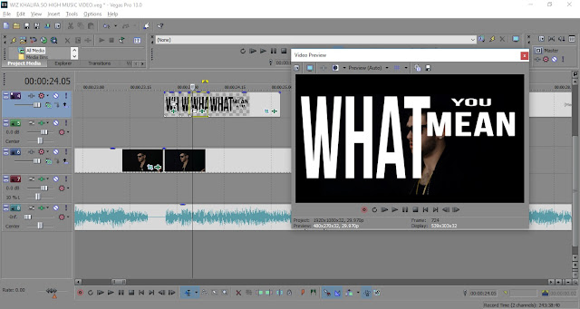
The picture above shows how I have added each words separately to the top of the footage in able to match the song's lyric. I hat to listen to the song carefully to have the  perfect time when to put certain words in. These words have been created with Photshop in a PNG non background format.

The photograph above shows how I have created each word for my music video. I have created different layers and I have saved them individually in able to insert them in one by one on the top of the footage on a separate track lane.

The photograph above shows the way I have done the glitch effect that I have used. I have separated the footage in every 2 frames, and then I have changed the way the frame is being positioned. All the frames had a different frame positioning
which allowed me a smooth and professional looking glitch effect to create.
Here I am showing how I have created the so called "black flash effect". I have separated the footage to single frames and I have removed every second frame, which allowed me to create a black flash effect. This effect features in a lot of trap, hip-hop and rap music video clips, and I wanted to include it in my music video clip after I have watched some tutorial videos